
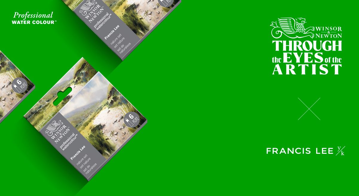
Francis Lee and W&N Nature Set
By Francis Lee:
My journey with Winsor & Newton began nearly 30 years ago. I first encountered their watercolours in a magazine called The Art of Drawing & Painting. I started with the Cotman range, learning to understand the medium and its delicacies. Today I use the Professional range, known for its clarity, transparency and luminous quality.
This affinity with Winsor & Newton has stayed with me over the years, and I am honoured to now introduce my first curated box set. It features a selection of colours that have become staples in my palette. The addition of Cinnabar Green brings a fresh mixing experience, opening up new nuances of tone within the landscape.
With this set, thoughtfully assembled, I hope you will find endless possibilities in exploring the subtle changes of light, atmosphere and hue in your own landscapes.
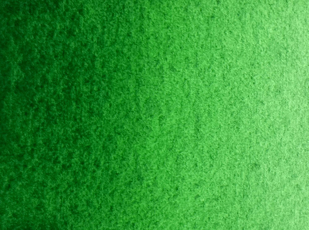
Discovering Cinnabar Green
Historically, Cinnabar referred to the vivid red mineral form of mercury sulfide — the source of Vermilion. There was never a natural “Cinnabar Green” in mineral form.
The name appeared in the 18th century when paint manufacturers began experimenting with mixed pigments to create new greens. Early versions were often blends containing copper compounds such as copper tartrate or copper arsenic, somewhat risky due to the toxic content.
By the mid-20th century, advances in synthetic pigments made it possible to recreate similar hues without toxicity. Winsor & Newton now use the name in honour of that heritage, but reformulated with safe, stable and lightfast ingredients.
A New Green, A Familiar Calm
There was something exciting about it, slightly zesty. It reminded me of a cilantro leaf, fresh and grounded. I rarely use green straight from the tube; I prefer to mute it slightly, and Cinnabar Green responds beautifully. It does not compete, nor does it disappear. It simply belongs.
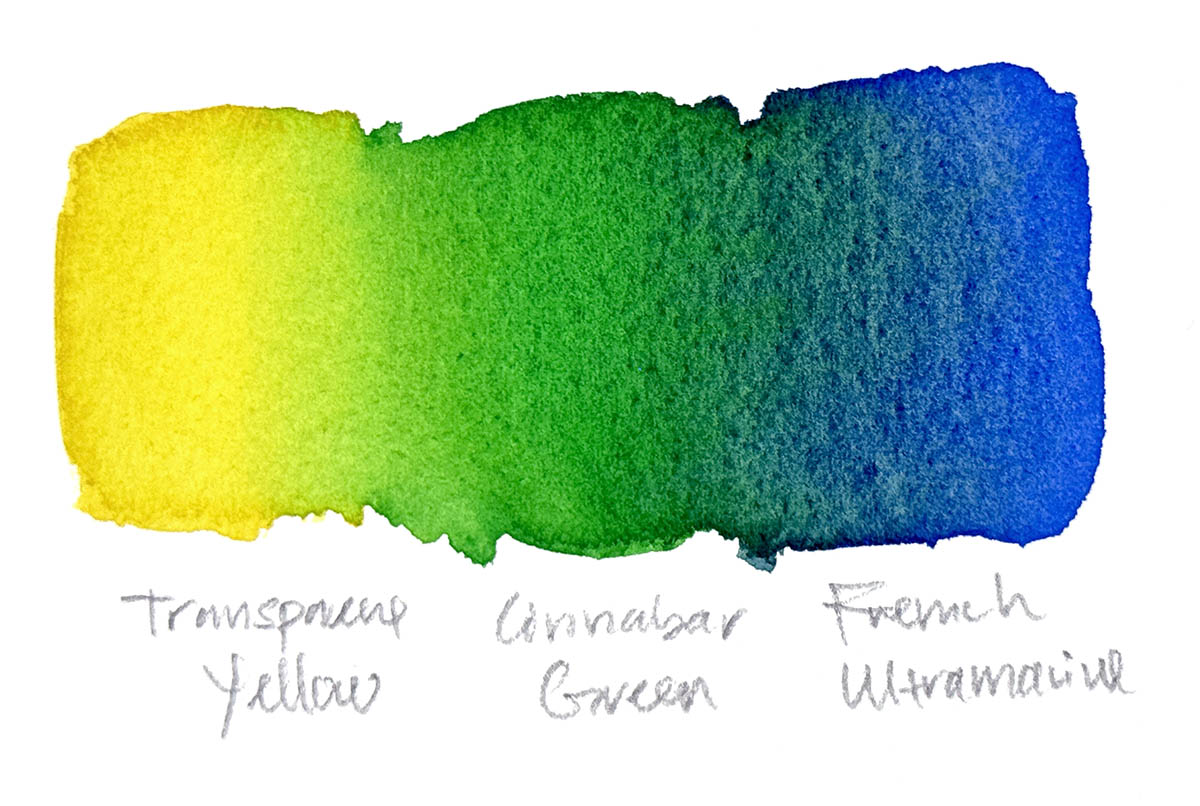
Green can always be mixed from blue and yellow, but I often prefer to work with efficiency. Having a green that is ready to use is genuinely helpful. When I need to warm it, I add a touch of Burnt Sienna or Transparent Yellow. To cool it, a hint of Ultramarine works well.
Cinnabar Green may be new to Winsor & Newton’s palette, but it feels timeless to me. It bridges emotion and observation, echoing the stillness I often seek in my work, where nature becomes a reflection of calm and the act of painting becomes a quiet conversation with the world.
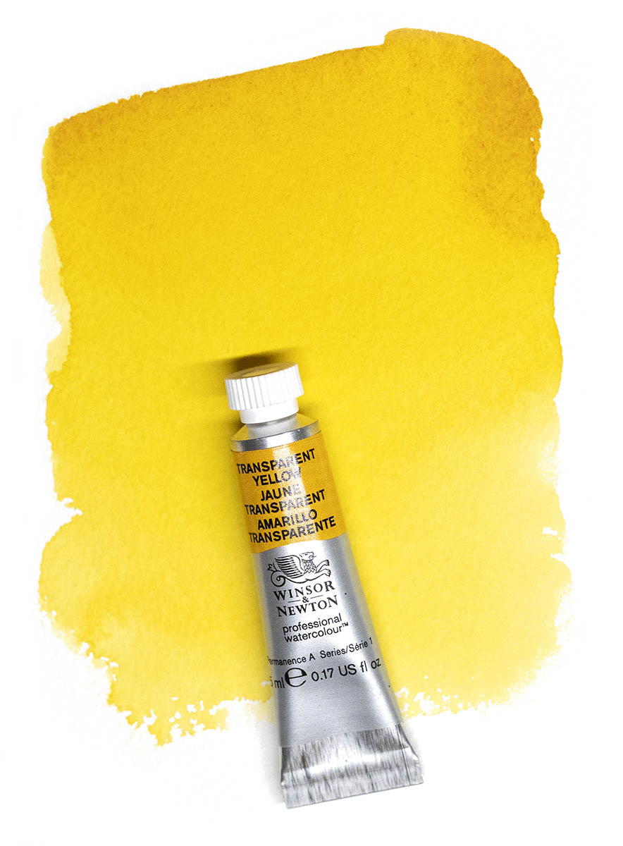
Transparent Yellow
Many yellow pigments tend to be opaque. Transparent Yellow, as the name suggests, is a warm and transparent yellow. When applied in greater concentration it resembles ochre, yet when diluted it shifts towards a cooler, clearer tone.
I was once very fond of Quinacridone Gold, especially in the earlier years of my practice. I still reach for it occasionally when adjusting greens, but these days I prefer a gentler approach. Transparent Yellow is Nickel Azo Yellow (PG150), which is one of the key components in the modern Quinacridone Gold hue. The genuine Quinacridone Gold pigment is no longer produced.
Including Transparent Yellow in the palette offers greater flexibility and cleaner colour mixing, as it is a single-pigment paint rather than a mixture. It adapts quietly to other colours and allows subtle transitions to emerge with ease.
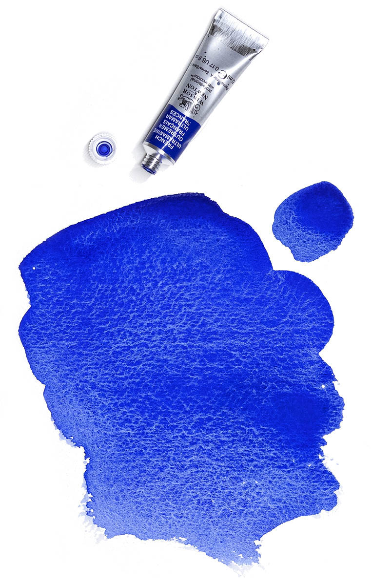
French Ultramarine
It was named French Ultramarine because it was invented by the French chemist Jean-Baptiste Guimet in 1826. His discovery made this indispensable colour far more accessible to artists. The original ultramarine was derived from the semi-precious stone lapis lazuli, a pigment once so valuable that it was reserved for the robes of the noble in portraiture and for sacred subjects in religious paintings and manuscripts.
I often use French Ultramarine mixed with Burnt Umber to create deep, dark values. Its natural granulation adds texture and character to a painting, allowing shadows and washes to settle with a gentle sense of movement and depth.
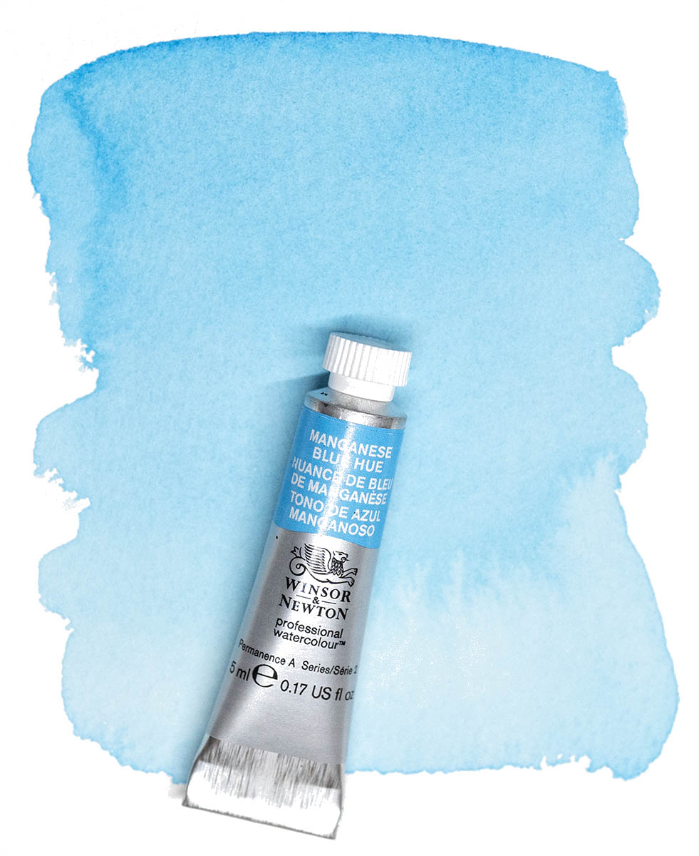
Manganese Blue Hue
This is another colour that is rarely spoken of. The original Manganese Blue (PB33) was first synthesised in 1907 and became commercially available in the 1930s. Production was discontinued in the 1990s due to environmental and health concerns related to its manufacturing process. I am glad we now have a hue version that captures its spirit.
I began using this colour a few years ago for summer skies. It has become a reliable choice. It is a good substitute for Cerulean Blue if you are working within a budget, and it granulates beautifully, adding a gentle texture to open skies and distant light.
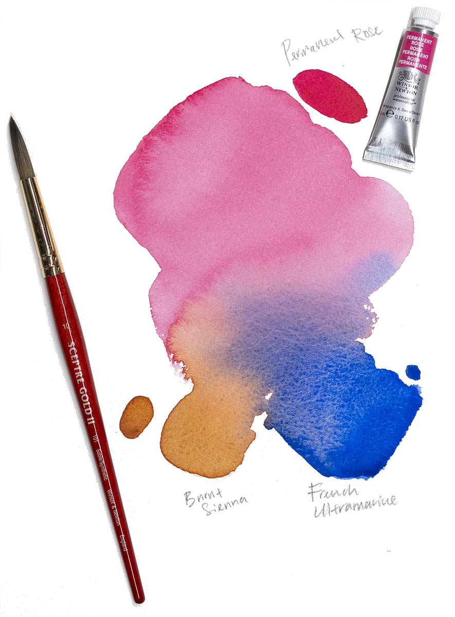
Permanent Rose
Permanent Rose is one of those colours that quietly earns its place on the palette. Made with the modern pigment PV19, it offers clarity, transparency, and a gentle vibrancy that does not overwhelm. It leans slightly towards the cooler side of red, which allows it to form clean violets when mixed with blues.
I reach for Permanent Rose whenever I need a subtle lift in a wash or a soft transition in shadow. It can be used in full strength for expressive accents, but it is in its diluted state that it truly shines, revealing a luminous glow that settles beautifully on the paper.
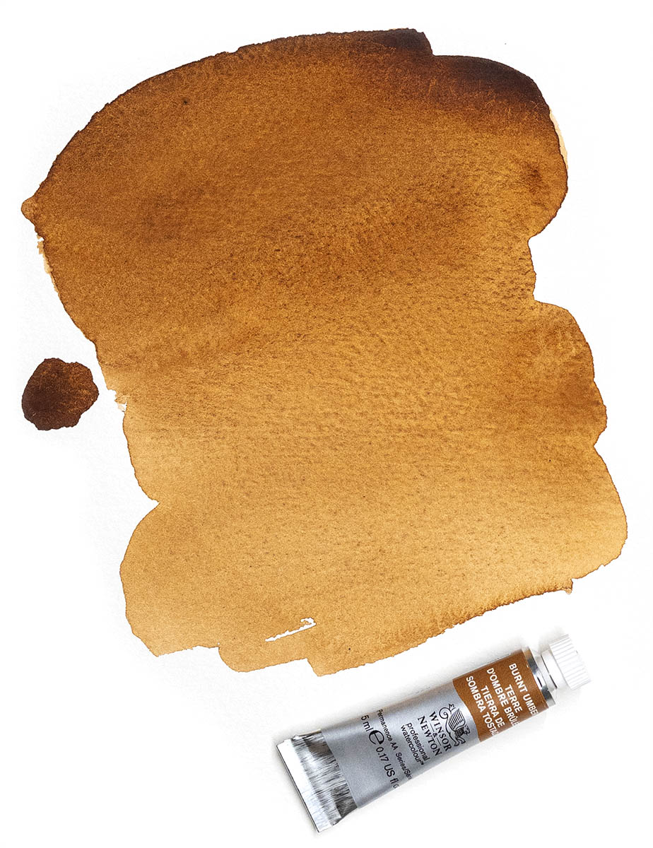
Burnt Umber
Burnt Umber is one of the most grounded and dependable earth pigments on the palette. Warm, natural, and familiar, it has been used by painters for centuries. Its strength lies in its versatility. In its concentrated form, it provides a deep, rich brown ideal for defining shapes and establishing shadows. When diluted, it softens into gentle, earthy tones that sit comfortably in landscape.
I often pair Burnt Umber with French Ultramarine to create a wide range of dark values. This mixture can shift from a cool neutral to a warm deep tone with only a slight adjustment in ratio. It allows control over depth without relying on black. Burnt Umber’s reliability and ease of mixing make it a quiet yet essential presence on my palette, forming the foundation of many of my darker passages and underlayers
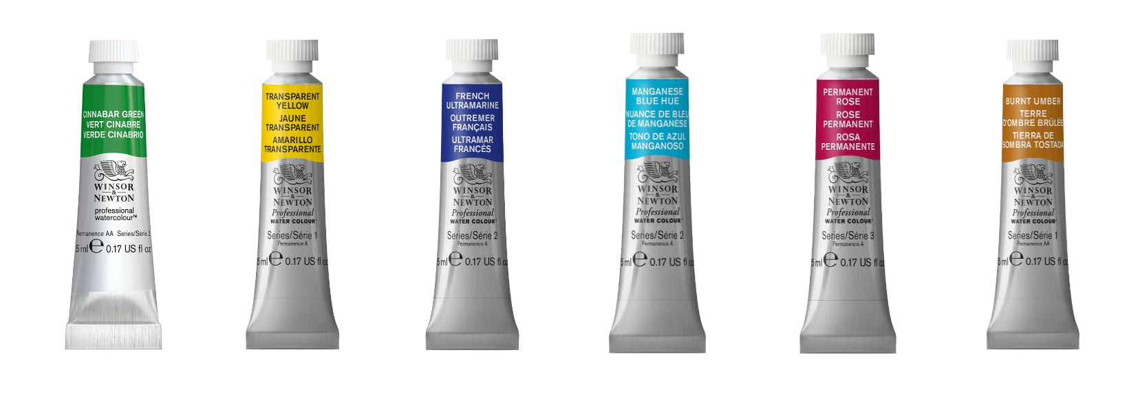
Each box contains six 5 ml tubes of Winsor & Newton Professional Watercolour. Available now at Premier Art.
Cinnabar Green
Transparent Yellow
French Ultramarine
Burnt Umber
Permanent Rose
Manganese Blue Hue
Francis Lee Nature Set is only available in Malaysia.
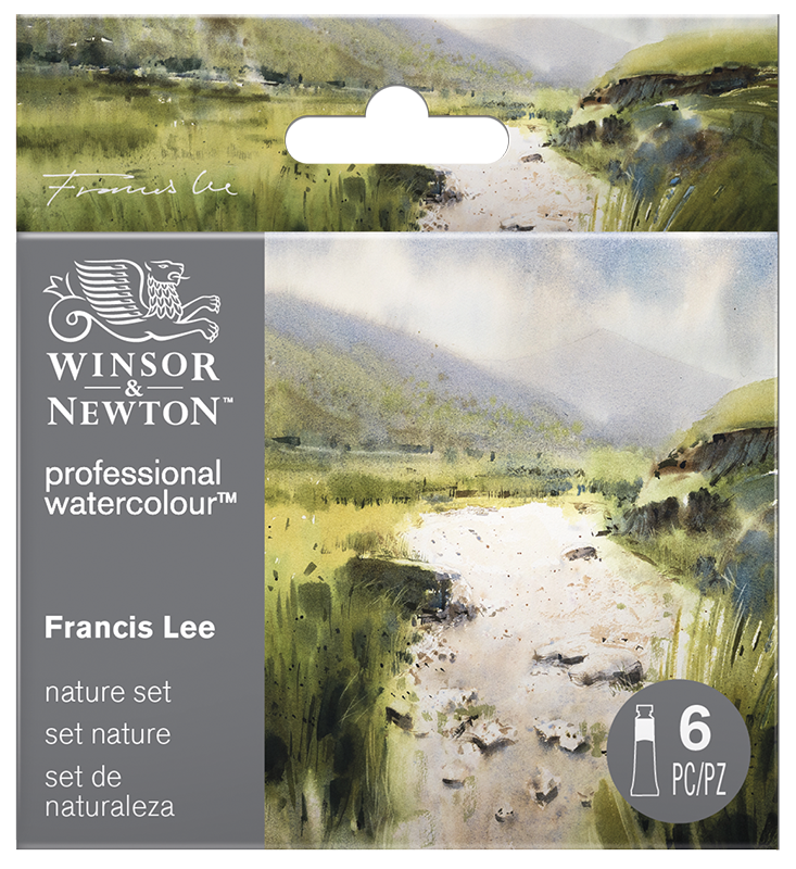
Click here to buy W&N Professional Watercolour Francis Lee Nature Set